.

Thursday, May 19

Smitten: My New Turquoise Door


Have you ever thought about painting a door in your home a favorite colour?

We just replaced the entrance to our now-nearly-complete basement with a new frosted glass door; and instead of painting it white like all the colonial-style doors in my home, I decided to give this one a little personality of its own!


I chose a shade of turquoise (of course!).  This door is in our open-concept kitchen/living room area, so it matches all my turquoise-inspired accents - like my drapery and backsplash. 

I am totally smitten.  The colour is Benjamin Moore Arctic Blue (2050-60).  LOVE it. I considered a whole range of colours in this family before settling on this one.  It's a really soft shade of robin's egg blue that is easy on the eyes and very soothing.  It makes me smile.

Here's how it looks in the context of some accessories:


So, if you've been considering painting a door in your home a great colour, my advice would be don't hesitate another second!

Until next time, happy decorating!


Labels: , , ,

Tuesday, May 3

How to Brief a Painter

Have you ever had a painter botch a room with the wrong colour?

Well, perhaps I'm just unlucky, but it's happened to me more than once.  Take for instance when we were just days away from moving into our new home (a few years ago), and my then 3-year old daughter's room was mistakenly painted blue instead of bubble gum pink.  Of all mistakes! She wasn't at all impressed. Of course, it was re-painted just under the wire of our closing date.

   This time around with our basement development project, I'm going to try and avoid any more painting bloopers. I've devised what I hope is a fool-proof briefing method. I must say, it's really high tech.  Just kidding; it's soooo not.  It's actually so obvious that I can't believe I hadn't thought of it earlier.  
Drum roll please...

Hooray for Post-it notes!


Given that my colour scheme involves three colours + white, AND that we are planning bead board on some walls, and accent walls in other areas, I figure that there's a fair chance our painter could screw things up if I leave it to his memory.  (I'm not giving him much credit, am I?  Poor guy. Well, you know what they say: once bitten, twice shy.)  

I've made my instructions really simple for him to follow by placing post-it notes on each wall with the correct colour name and code.  

This also allows him to more easily judge how much of each paint colour he needs to purchase.

This exercise was actually a really helpful method for 'visualizing' the transitions from one colour to another throughout the space.  


Once I had all my initial post-its up, I lived with my colour choices for a few days. Each time I walked through the space, I ended up 'seeing' something problematic.  So I'd just pull off the post-it note, and replace it with another colour until I was finally happy with it.

Easy peasey.

So the next time you need to brief a painter, pull out your post-its and start sticking.  It's fool-proof.  I hope!


 Until next time, happy decorating,


Labels: , ,

Friday, April 29

Picking Paint: When The Love is Gone

I love decorating, but I have to tell ya, picking paint colours is pretty low on my list of favorite tasks.

For me, it's a love-hate, ying-yang kinda thing. Excitement and apprehension. Gittyness and dread.

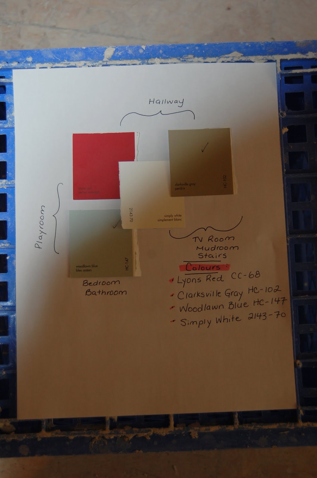
Right now, I'm trying to make some paint decisions for my basement development project and the love is gone. I'm really not having fun anymore.  Actually, let's be honest. I'm in paint chip hell.


I've been through Behr's, Martha Stewart's, and Benjamin Moore's entire decks.

I mean how many shades of gray and taupe and green can one brain really process at once? Does there really need to be a gazillion?  Did they miss the memo on information overload?

And, by the way,  why do they call something "tan" when it is clearly gray? Or "gray" when it it so obviously tan?  I swear it's a conspiracy just to fool us into buying more paint when the "gray-you-thought-was-gray-because-it-was-called-gray" was actually tan when you put it on the wall ;-).

Am I making this all too complicated? Because it wouldn't be the first time, lol.

Did I mention that I tend to analyze?  And, over-analyze?

And maybe my professional background has tainted me.  In in advertising and communications, colour selection is a critical element in persuasion; as much an art as a science. The psychology of a particular hue - from it's undertone to it's intensity - can be endlessly debated before a final decision is made.

But (tapping head with knuckles) it's just my basement, not a 7-figure ad campaign.  I mean, really. What's the big deal if I choose Providence Olive over Sag Harbour Gray?  Will the sky come crashing down?

That's it.  I am putting my five short-listed  paint chips in a hat and having my 6-year old pick one.


(Fingers crossed, she picks Providence Olive. Or, Sag Harbour Gray.  Or...)


Labels: , ,