Pottery Barn Kids "Surf Plaques" Knock Off: My First Silhouette Project!
I'm so excited to show you my very first Silhouette project, a Pottery Barn Kids wall art knock off!
I was looking to create some wall art for the new playroom in the basement, and went looking for inspiration. Where else does one go? Pottery Barn Kids, of course!
The playroom has to be a shared space for our 20-month twin boys and out 7-year old daughter, so I wanted the artwork to be fun and whimsical, yet gender and age neutral. Not that easy. But I've always LOVED this series of artwork at PBK called "Surf Plaques", and it perfectly matches my criteria! Each of these pieces retails for $40US, so for a set of 4, $120US.
I knew it was going to be an ambitious project for my first try with my new Silhouette, but since I haven't been crafting much lately I was up for the challenge!
The first thing I did (after reading up on how to use the Silhouette and working through some confusion, lol), was to download and cut sea creature shapes out of card stock, similar to the Pottery Barn ones.


Next, I painted the shapes using water paints to get a softer less uniform effect. You don't need to be an artist or use fancy paints for this. I grabbed my daughter's $2 water paints, and they worked perfectly!

It's a little hard to see in the photos above, but the PB artwork has fun facts about each of the sea creatures. So I googled each of the animals, and came up with some potential words for each piece. Then I put them into my Silhouette software, and printed them out on black adhesive vinyl.


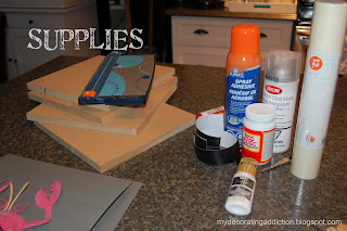 Once I had all my vinyl cut, it was time to mount the painted shapes and words to boards. I used 4 pieces of 11x11 mdf that, lucky for me, were leftovers from our basement development project. Some of the other things I used: textured card stock, white craft paint, mod podge, spray adhesive.
 I painted the boards with one thin coat of white craft paint, allowing some of the wood to peek through to give it a distressed look. Next, I cut my textured card stock to 9x9, and dry brushed it with white paint. Then I adhered it to the board with spray adhesive (although you could just use mod podge), followed by the water-painted sea animal shapes.
 I didn't use the Silhouette transfer paper to apply my letters as I didn't want them to be straight. I wanted to create curved words, just like the PB originals. But I've gotta tell ya, it took a lot of patience to pull each vinyl letter from the backing with my finger nails, and them apply them without curling them!
 Once I had the lettering applied, I "ooh-and-aah-ed" ;-). And the I gave each piece a coat or two or mod podge to seal everything together and give it a nice finished look.
Once the Mod Podge was dry, I finished them off with some spray varnish (in matte). I don't think this step was critical, as the mod podge already gave them a nice finished look. So if you don't have any spray varnish on hand, don't sweat it.

It was after midnight when I finished up. So I left them overnight on the kitchen island to dry and set. I was so excited in the morning when I came down and took another looksy.
Here's the final pieces....


And now for the cost...um, like $4. For all four. So $1 each. I had all of the craft products on hand, so all I had to pay for were the shape downloads from Silhouette. It's amazing what you can create (well, OK, in this case re-create, lol) with stuff you already have in your craft room.
If you liked this tutorial, you can 'follow' my blog on the right side-bar!
Until next time, happy crafting.
And P.S., hope you'll come back and visit again soon to see these pieces in our new playroom!

I'm sharing this post at...







I was looking to create some wall art for the new playroom in the basement, and went looking for inspiration. Where else does one go? Pottery Barn Kids, of course!
The playroom has to be a shared space for our 20-month twin boys and out 7-year old daughter, so I wanted the artwork to be fun and whimsical, yet gender and age neutral. Not that easy. But I've always LOVED this series of artwork at PBK called "Surf Plaques", and it perfectly matches my criteria! Each of these pieces retails for $40US, so for a set of 4, $120US.
 |
| Photo credits to Pottery Barn Kids |
 |
| Photo credits to Pottery Barn Kids |
 |
| Photo credits to Pottery Barn Kids |
I knew it was going to be an ambitious project for my first try with my new Silhouette, but since I haven't been crafting much lately I was up for the challenge!
The first thing I did (after reading up on how to use the Silhouette and working through some confusion, lol), was to download and cut sea creature shapes out of card stock, similar to the Pottery Barn ones.


Next, I painted the shapes using water paints to get a softer less uniform effect. You don't need to be an artist or use fancy paints for this. I grabbed my daughter's $2 water paints, and they worked perfectly!

It's a little hard to see in the photos above, but the PB artwork has fun facts about each of the sea creatures. So I googled each of the animals, and came up with some potential words for each piece. Then I put them into my Silhouette software, and printed them out on black adhesive vinyl.


This part didn't go as smoothly as I had hoped. I made a few mistakes which I'll share with any of you new Silhouette users so that you can try and avoid them. If you are an experienced user, skip the next paragraph!
First, when cutting vinyl, you do not need to use the carrier sheet! Just feed that sucker right into the machine. Secondly, when feeding vinyl, make sure that your display says "Load Media", not "Load with Carrier Sheet". Finally, use a font style and size that is not too thin/delicate. I learned the hard way. Oh the horrors. On my first attempt, the machine cut right through the vinyl and the backing. On my second attempt, many of my vinyl letters wouldn't come free from the backing at all as the blade didn't cut deeply enough. Finally, after reading some awesomely helpful posts by other bloggers, I got it right!
 Once I had all my vinyl cut, it was time to mount the painted shapes and words to boards. I used 4 pieces of 11x11 mdf that, lucky for me, were leftovers from our basement development project. Some of the other things I used: textured card stock, white craft paint, mod podge, spray adhesive.
  I painted the boards with one thin coat of white craft paint, allowing some of the wood to peek through to give it a distressed look. Next, I cut my textured card stock to 9x9, and dry brushed it with white paint. Then I adhered it to the board with spray adhesive (although you could just use mod podge), followed by the water-painted sea animal shapes.
 I didn't use the Silhouette transfer paper to apply my letters as I didn't want them to be straight. I wanted to create curved words, just like the PB originals. But I've gotta tell ya, it took a lot of patience to pull each vinyl letter from the backing with my finger nails, and them apply them without curling them!
 Once I had the lettering applied, I "ooh-and-aah-ed" ;-). And the I gave each piece a coat or two or mod podge to seal everything together and give it a nice finished look.
Once the Mod Podge was dry, I finished them off with some spray varnish (in matte). I don't think this step was critical, as the mod podge already gave them a nice finished look. So if you don't have any spray varnish on hand, don't sweat it.

It was after midnight when I finished up. So I left them overnight on the kitchen island to dry and set. I was so excited in the morning when I came down and took another looksy.
Here's the final pieces....


And now for the cost...um, like $4. For all four. So $1 each. I had all of the craft products on hand, so all I had to pay for were the shape downloads from Silhouette. It's amazing what you can create (well, OK, in this case re-create, lol) with stuff you already have in your craft room.
If you liked this tutorial, you can 'follow' my blog on the right side-bar!
Until next time, happy crafting.
And P.S., hope you'll come back and visit again soon to see these pieces in our new playroom!

I'm sharing this post at...
Labels: Crafting, DIY, Inspiration, Kids Rooms, Living with Kids, Silhouette, Tutorials, Wall Art, Yummy Accessories
posted by Kerri at
8:11 AM
11 Comments


